An index value plot is a graph that shows positive and negative fluctuations across a middle line called the norm line, which is what is normal over a period of time. The above is a graph of the monthly values for the AMO (Atlantic multidecadal oscillation) index.
Wednesday, July 30, 2014
Standardized Choropleth Map
A standardized choropleth map compares distributions among multiple areas. The above is a standardized choropleth map of death ratios that show high risk areas of cervical cancer.
Correlation Matrix
A correlation matrix is a grid that shows the covariances between the different elements of vectors. The correlation above shows a strong connection in the middle of the grid and is gets lower as it goes outward. This grid was used in science to correlate protein activity.
Propaganda Map
A propaganda map is much like a mental map. It is a personal representation of an area or thing, not always very accurate and usually very decorative. Above is a wartime propaganda map of Asia.
Continuously Variable Proportional Circle Map
A continuously variable proportional circle map displays its information with circles that are proportionate to the data being measured. The higher the value, the greater the circle and the lower the value, the smaller the circle. The image above is an early example of this type of map, showing the proportion of different types of meat sent to Paris from different areas of France.
Social Network Map
A social networking map is a map that shows the connections between social life and social networking systems. Above is a social network map of individuals and how there are all connected by social interactions with places, jobs, or friends.
Classed Choropleth Map
A classed choropleth map includes a legend with both color coordinated classifications and numerical values for each color within that legend which is then shown on the map for the corresponding values. The map above is a classed choropleth map of the percent of uninsured population within the state of Texas.
Cartographic Propaganda
A cartographic propaganda map is created to promote propaganda or to persuade. Typically it isn't accurate and not used to be a travel map, but just to portray a position and grab attention. The above map is a propaganda map of constellations and the figures they form in the eyes of the map creator.
Thematic Maps
Thematic maps are used to show specific patterns or themes in a certain or chosen area. The map above is a thematic map of the population density in New England in 2000. The closer to red, the higher population density and the closer to yellow the lower.
Proportional Circle Map
A proportional map expresses data using different sized circles. The higher the value in an area, the larger the circle. The map of Europe above uses circle size to show the number of internet users in 2004.
Isotach
An isotach is a map in which incorporates the information on wind speed and direction of a certain area. The map above is an isotach map of Florida showing the wind speeds between the contour lines.
Choropleth Map
A choropleth map is a thematic map that displays information based on shading of the areas and data being displayed. It often comes with a legend for the measurements of each level of shading. The map above is a choropleth map of the US, with the color coded legend underneath in quintiles, showing the percentage of individuals living in poverty by county in 2000.
Tuesday, July 29, 2014
Statistical Map
Statistical maps are like choropleth maps and show a variation in quantity of factors such as population, rainfall and crops in a geographical location. Above is a statistical map of the unemployment rates in Oklahoma by each county.
Lidar
Lidars (a combination of the words "light" and "radar) are remote sensing techniques using light detection and radar. They measure distance to an object while using light. The map above shows the colors of an area with various colors related to the height of the buildings.
DOQQ
DOQQs (digital orthophoto quarter quads) are digital aerial photos that combine characteristics of a photograph and a map. The example shows the geographic changes of sections of Louisiana after Hurricanes Katrina and Rita.
Cadastral Map
Cadastral maps show the property details about a specific area, usually depicting the property of homes in neighborhoods and businesses. Above is a cadastral map of a typical neighborhood showing the plots, or separation of the properties.
Unclassed Choropleth Map
An unclassed choropleth map is a choropleth map except for one aspect -- it does not have a legend to represent the data on the map. Above is an unclassed choropleth map because the legend is absent so you don't know what the different shadings mean without a written explanation.
Public Land Surveying System
The Public Land Survey System is how public land is mapped in the US using prinncipal meridians and baselines. The map above is a portion of Minnesota's statewide PLSS base map.
Isopleth
Isopleth maps are the general name for a large of maps. They use the characteristic contour lines of topographic maps to group areas of similar values. Examples of isopleth maps are isohyets, isopachs, and isotachs. The map above is a isopleth because it uses contour lines to show amount of rainfall (isohyet).
Box Plot
Box plots are often used to compare many different variables at once, using a mean, median, and range of distribution. The box plot above compares actual salaries to market salaries for the job of Engineer II.
Star Plots
A star plot compares multiple variables at one time and displays the data visually. The father from the center a line goes, the greater the value; the shorter the line the less value. The star plot above compares several aspects (population, wind, precipitation, etc.) in four US cities.
Lorenz Curve
The lorenz curve is a representation of the actual distribution of wealth plotted against absolutely equal distribution. The variable is compared to a line of equality that is constant. Above is a lorenz curve comparing the per capita income in Brazil and Hungary.
Infrared Aerial Photo
Infrared aerial photos are mainly used to detect differences in an environment, usually using the colors red and blue. The map above is an infrared aerial photo looking on top of a city.
Black and White Aerial Photo
A black and white ariel photo is exactly what it sounds like - a black and white aerial or "from above." The picture above is a black and white aerial photo of a city showing a river and trees.
Triangular Plot
A triangular plot is a graph that shows information based on 3 different variables in the shape of a triangle. The plot above is a triangular plot of areas with the geological composite relative to the 3 types of ground: clay, silt, and sand.
Similarity Matrix
A similarity matrix is a chart that shows the similarities between different variables. Above is a similarity matrix of genetic clusters - the closer to the red line the closer they are.
Isobar
An isobar is an isopleth map that depicts air pressure through contour lines. The map above is an example that is on a paragliding web site, because air pressure would be important for people engaging in that.
Doppler Radar
Doppler radars provide velocity data about an object in a specific area or distance, and are often used for weather and for police to catch speeding cars. Above is a doppler radar that is measuring the speed of a hurricane over the southern part of Florida and the direction and speed it is moving.
Bivariate Choropleth Map
A bivariate choropleth map is a choropleth map that contains 2 variables instead of just one and often uses different colors or symbols to depict the differences. Above is a bivariate choropleth map on voter turnout and margin of victory in the 2004 presidential election.
Unstandardized Choropleth Map
An unstandardized choropleth map is a choropleth map with out any kind of specific order. So in a way there are no rules involved. Above is an example of an unstandardized choropleth map because the colors are completely different and not related in any way, other than a language.
Topographic Map
Topographic maps use contour lines to show elevation, or relief. The contour lines can also be used for all kinds of information like rainfall as seen in a isohyet. The map above is a topographic map of a mountainous place and you can see where some places are steeper than others because the lines are closer together.
Population Profile
Aa population profile graph shows people as a function based upon their ages, often separated in multiple age groups or by gender. Above is a population profile based on gender and age from the 2010 census in Washington DC.
Isohyet
An isohyet is a map that contains lines that connect certain areas of equal rainfall together, resembling a topographic map but showing rainfall rather than elevation. Above is a isohyet of the rainfall on the island of Kaua'i.
DRG (Digital Raster Graphic)
A DRG is a digital image from a scan of a paper USGS topographic map The map above is a digital topographic map scanned and made for computer usage.
Bilateral Graph
A bilateral graph is a chart that shows two or more sets of data either side by side or stacked up on top of each other, sometimes seen as histograms or line graphs. Above is a bilateral bar graph that shows complications patients in different age groups had with total hip or total knee replacements.
Stem and Leaf Plot
A stem and leaf plot is a mathematical technique usually used for collecting numerical data. It often helps finding mean, median and mode of the numbers collected. The plot above is a stem and leaf because it has the left side which is called the stem, the right side which is the leaf and the numbers come together as a collection of easy to read data.
Parallel Coordinate Plot
A parallel coordinate plot has multiple vertical axis with lines interconnecting them as a set of points. They are mainly used to see relationships between several different variables. The plot above is a parallel coordinate plot because is has the multiple vertical planes with the lines and relationships flowing between them along with the color coding scale on the side. It compares all cells in a fruit fly with nine selected genes.
Dot Distribution
A dot distribution map shows analytical data through representation of spatial patterns, and can be used for many purposes, such as population density. The dots represent a single number and are used to map out the data. Above is a dot distribution map of people who are bird FeederWatchers in the U.S.
Climograph
A climograph is a graph that visually illustrates both the precipitation and the temperatures of a particular area in a histogram or line graph style, within a specific time interval. Above is a climograph of Boulder, Colorado showing the temperatures and the precipitation within a year.
Monday, July 28, 2014
Nominal Area Choropleth Map
A nominal area choropleth map is a type of choropleth map that portrays categorical information. The map above represents US minority groups with the highest percent of population in an area, and it is a nominal area choropleth map because instead of showing a numerical value it just has the categorical values.
Isoline
An isoline map is a general category of map that uses contour lines to depict data. Above is an isoline map that shows the mean annual precipitation in Mexico.
Histogram
A histogram is a graph that represents a set of data on an X and Y axis base, often seen in statistics and surveys. Above is a histogram representing the average frequency of 100 men and their heights in cm. The histogram above compares the heights of the men.
DEM (Digital Elevation Map)
A DEM is a 3 dimensional map that uses contrasting color to represent elevation over a large area. Above is a DEM of Nigeria. The higher the elevation is represented by a orange color and as the elevation goes down then the color becomes green then blue. It is also a 3 dimensional map because it has shadowing represented by the black shadows in the information.
Cartogram
Cartograms are visual representations on a map that expand or contract a specific area based on the given information. Above is an example of a world cartogram based on the population of people in each continent. The continents are larger or smaller than reality based on the population..
Windrose
A windrose graph shows the wind conditions of an area on a circular graph which represents a compass or a directional system relative to the direction on earth. The graph above is a windrose showing the direction of wind to the north, south, east west, and the wind speed in the particular direction at a given point.
Scatter Plot
Scatter plots are graphs that show information based on 2 different variables or sets of data that are represented by dots. Sometimes the dots are connected by lines using the average of the dots expressed in the data, if there is a correlation in the data. These are typically seen in statistics. The maps above are examples of the kinds of relationships that can be shown in scatter plot graphs. Each has the X and Y axis and distribution of data.
Nested Grid Model
NGM's or nested grid models are maps that show forecasted and analytical information of an area Above is a nested grid model representing a forecast and weather analysis of an area being affected by a hurricane.
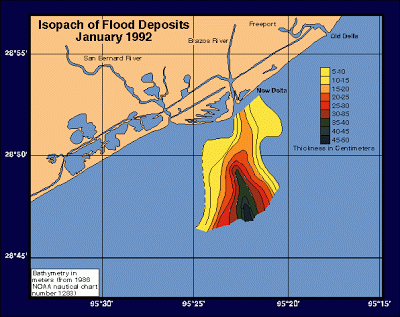
Isopach
An isopach is a map that represents data on rock or geological information. The isopach above shows rock density in centimeters after a flood deposit from a river in 1992.
Flow Map
A flow map represents data that flows from one point to another or one variable to another, typically represented with arrows or lines going from one point to another. The map above is a family tree of the hit show The Simpsons. It is a flow map because its shows the flow of genes and relative flow of the family.
Cartographic Animation
A cartographic animation is created to represent an occurrence or visual event at a specific time and place. The image above represents a cartographic animation because it is shows how a hurricane will move over the panhandle of Florida and Alabama.
Subscribe to:
Posts (Atom)